

8 Weeks of Journey in Machine Learning

Hello World! Here, I share my eight-week journey of hands-on machine learning.
It’s been an adventure filled with new skills and real-world challenges. From coding basics to solving real-world applications, each week was a step forward in this exciting field.
Here’s a quick look at what I’ve learned.
#Week 01
“Kicking Off My Machine Learning Journey: Python and NumPy in Action”
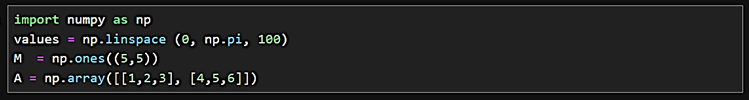
This week marked the beginning of a thrilling journey into the world of Applied Machine Learning as part of my Master’s in Smart Energy. I dove into the Python programming language, getting my hands with the foundational NumPy library.
Here’s a snapshot of what I tackled:
- Creating arrays with precise intervals using np.linspace — essential for modeling and simulations.
- Exploring array manipulation with multi-dimensional structures, fine-tuning the data for analysis.
- Writing functions and loops in Python, which are the building blocks for automating data processing tasks.
Each line of code brought me closer to understanding how we can harness the power of machine learning in smart energy solutions. I’ve learned that before any complex analysis, it’s pivotal to grasp these fundamentals — they are the stepping stones to building robust algorithms.
Analyzing data might seem daunting, but it’s like solving a puzzle. Each piece of data fits into a larger picture, and with Python, I’m learning to see the whole image.
As I continue this series, I’ll share more about my progress and insights. Stay tuned!

#MachineLearning #Python #DataScience #SmartEnergy #LearningJourney
0—The End—0
#Week 2
Diving Deep into Sports Performance with My ML Adventures
This week’s Machine Learning transported me right into the center of a soccer field – virtually, of course!
I analyzed positioning and movement data from a soccer match and uncovered the hidden patterns of play.

First up, the acceleration chart: It’s like a heartbeat monitor for soccer actions. Each up and down tells a story of sudden sprints, stops, and high-flying jumps. This isn’t just a bunch of lines; it’s a window into the player’s effort and energy throughout the game.
Imagine being able to measure the intensity of a player’s match and then tailoring their training to boost stamina where it counts!

Next, the GPS tracking: It’s a treasure map that marks where the action happens. With every dot and line representing the player’s journey across the field, strategies spring to life off the page.
Coaches could use this to fine-tune formations, improve team coordination, and plan out plays that play to their team’s strengths.
This kind of data can be a game-changer. It has the potential to revolutionize how we approach sports training and game-day tactics. From enhancing individual player performance to choreographing a team’s movement on the field, the insights gleaned from these visual stories are powerful. It’s about turning raw data into actionable strategies that could lead to that championship win.
And that’s the real goal – using machine learning not just to understand the present, but to shape the future of the sport!
Note: The first image is a line graph that displays three types of accelerations experienced by a soccer player during a match: forward, side, and up. Each line represents the intensity and frequency of movements in each direction over a period of time. This type of analysis can provide insights into a player’s activity, indicating periods of high intensity or quick movements that could correlate with key moments in the game, such as sprints, tackles, or jumps.
The second image is a scatter plot that maps the player’s positions on the field, using latitude for the x-axis and longitude for the y-axis. The density and pattern of the points can show the areas where the player was most active, which can be crucial for understanding player behavior, team formations, and movement strategies. Coaches and analysts might use such a plot to plan training sessions focused on position-specific stamina and skill or to devise tactical plays that utilize the player’s movement patterns effectively.
In general, these visualizations turn raw data into a narrative about the player’s performance and the dynamics of the game. They serve as tools for improving individual and team performance, allowing for a more scientific approach to sports training and strategy.
#SportsScience #DataDrivenDecisions #FutureOfCoaching #Soccer #MachineLearningInAction
0—The End—0
#Week 3
Machine Learning: Discovering the Patterns of Speech
This week’s machine learning class was all about the sounds of speech. Think about how we say “bat” and “cat” — they sound similar, but one letter changes everything. That’s what phonemes are all about, the tiny sounds that make up everything we say.
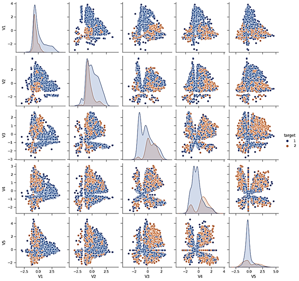
I’ve attached a colorful chart called a pairplot. Imagine it like a map that shows how different sounds relate to each other. The colors and positions of the dots help us see how small changes in sound can mean different words.
Why is this cool? It helps computers understand us better! When we talk to our phones or smart speakers, we want them to get it right, whether we’re asking for weathers or our favorite song.
So, this is more than just a class project; it’s about making our gadgets smarter and our lives a little easier. Can’t wait to share what comes next as we keep exploring the data behind the dialogue!
#LearningIsFun #TechForEveryone #SmartTech #MachineLearning
0—The End—0
#Week 4
Machine Learning: A New Lens on Cellular Health
This week, I had a fascinating peek into how light can tell us about health!
Imagine shining a light through a prism and seeing a rainbow spread out. Now, what if each color in that rainbow could tell you something about the health of a cell? That’s the magic I worked with this week – using a technique that breaks down light to reveal secrets about liver cells.
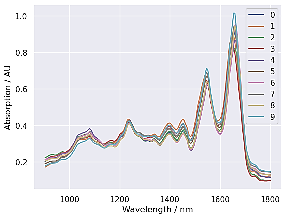
The beautiful lines in the chart are like different stories of cells, each bend and curve representing how cells interact with light. It’s not just a pretty picture; it’s a snapshot of health, hidden in the waves of light.
And guess what? This isn’t just for scientists in labs. It’s the kind of tech that might one day make health check-ups as easy as taking a selfie, shining a light, and getting insights into our well-being.
This week’s adventure in machine learning took me into the microscopic world of liver cells! I used some smart math to transform how we see and understand the health of cells using light – a technique with the potential to revolutionize medical diagnostics.
The first stop was using PCA, a way to simplify complex data and focus on what matters most. The bar chart I’ve shared shows how we can capture the essence of data with just a few key elements. It’s like finding the main ingredients in a complex recipe!
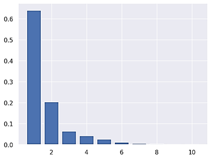
The bar plot shows the proportion of the dataset’s variance that each principal component captures. The first bar being the tallest indicates that the first principal component accounts for the most variance within the dataset.

The scatter plot displays the dataset in the new feature space defined by the first two principal components. Each point in the scatter plot corresponds to a sample in your dataset, plotted according to the values it takes on these two new axes. The colors represent the different types of cells, allowing you to see how well-separated these cells are in the reduced feature space. The color bar translates the numerical codes back to the cell types they represent.

Next, I explored UMAP, an advanced technique that helps us see patterns and natural groupings in data. The colorful scatter plot is more than just pretty; it’s a map of cellular features that helps identify what makes each cell unique.
The scatter plot generated from the UMAP projection provides a visual representation of how the data is grouped or clustered when reduced to two components.
Together, these techniques are not just powerful tools for data scientists but also hold promise for earlier and more accurate disease detection.
Imagine a future where a quick scan unveils the story of your health in vivid detail! As we blend technology with healthcare, we’re on the brink of a new era where prevention is better than cure.
#MachineLearning #HealthTech #Innovation #DataVisualization
0—The End—0
#Week 5
Machine Learning: Decoding the Mysteries of Cells
What a week it’s been! In my machine learning journey, I’ve dive deeper into the world of unsupervised learning, where we teach machines to find patterns all on their own.
This week’s spotlight? – Liver cells!
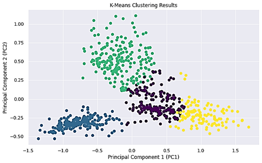

Using a technique called PCA, I reduced the complexity of spectral data to its most telling features. Then, I invited K-Means and Gaussian Mixture Models to the party, two algorithms that helped group these features into clusters. The colorful plots here show how these clusters form distinct groups that can correspond to different cell types.
But didn’t stop there! I calculated a confusion matrix to see how well our clusters matched up with known cell types and found where the majority of DNA-type cells landed. Plus, I even checked the probability of each sample belonging to its cluster.
Each step is like fitting together pieces of a puzzle. The more we understand about these cells and their characteristics, the closer we get to unlocking new paths in medical science.
Imagine a future where diagnosing an illness is as simple as analyzing a spectrum of light from a cell sample. As we blend data, science, and health, we’re not just learning; we’re paving the way for smarter healthcare.
Note: The different colors represent different clusters identified by the KMeans algorithm. The distribution of points in the plot suggests how the algorithm has partitioned the data based on similarities among the samples in the reduced feature space (the first two PCA components).
This visualization is a crucial step in exploratory data analysis, as it can reveal underlying patterns or groupings in the data that might not be apparent in the high-dimensional space. It’s particularly useful for identifying potential subgroups within the data without using any of the label information.
The different colors represent the clusters as determined by the GMM, with each point’s color corresponding to the most likely cluster that the model has assigned it to.
The visualization also shows how the GMM algorithm has partitioned the data in a probabilistic manner. Unlike K-Means, which assigns each sample to a single cluster, GMM provides a soft-clustering approach, where each sample has a certain probability of belonging to each cluster.
Both the K-Means and GMM plots will be useful for, as they show two different approaches to clustering: one that assumes distinct, non-overlapping clusters (K-Means) and another that allows for a more nuanced, probabilistic clustering (GMM).
#MachineLearning #DataScience #HealthTech #UnsupervisedLearning #Innovation
0—The End—0
#Week 6
Machine Learning: From Satellites to Solutions
As I continue my exploration of machine learning, this week’s challenge was to look at the Earth from above – through the lens of satellite images!!!
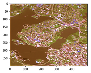
This is a satellite image of Palosaari
(where I live! Catch me if you can!)
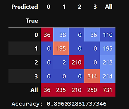
Tasked with classifying land use in a manner similar to the Dynamic World land use map, I trained a KNN classifier to assign land use types to pixels from a satellite image. By using a pipeline that combined data scaling and KNN classification, I could accurately mirror the classifications of the Dynamic World data.

The accuracy was spot on, with precision on the training set is high. Cross-validation and test scores also seem successful, which validating the robustness of the model.


But what does this all mean?
It’s about taking the bird’s-eye view we have of our planet and making sense of it. It’s about tracking changes in land use, understanding environmental impacts, and aiding sustainable development.
The confusion matrix, a table used to describe the performance of a classification model, revealed insights into which areas are frequently misclassified. It’s a vital tool for fine-tuning our approach to ensure each pixel of land is understood for what it truly is.
As we teach machines to interpret our world with greater precision, we unlock new potential for monitoring ecosystems, managing resources, and planning our cities of the future.
Here’s to another week of learning, discovery, and growth!
#AIForEarth #MachineLearning #RemoteSensing #Sustainability #TechForGood
0—The End—0
#Week 7
Machine Learning: Fine-Tuning the Instruments of Analysis
This week’s machine-learning journey took me into the depths of Ensemble Classification and the art of Hyperparameter Tuning!
With a dataset reflecting the spectral signatures of liver cells, my mission was to refine an ExtraTrees classifier — a model that’s like a symphony of decision trees, each contributing to a harmonious prediction.
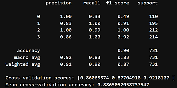
The initial performance was promising, but we could reach higher.
Enter GridSearchCV — the algorithmic equivalent of a treasure map, guiding us to the optimal settings for our model. It searched through forests of parameters, seeking the ones that would lead us to the X that marks the spot.
And we struck gold! The optimized model outshined its predecessor, with higher cross-validation accuracy and a confusion matrix that painted a picture of improved classification.
It’s not just about building models; it’s about refining them until they sing the right notes of precision and reliability. This is the essence of hyperparameter tuning — an essential step in the machine-learning pipeline that ensures our models perform at their best.
This narrative emphasizes the importance of model optimization and how it can lead to better predictive performance.
As I close the chapter on Week 7, I’m reminded that the journey to machine learning mastery is much like tuning an instrument — requiring patience, attention to detail, and an ear for the subtle changes of data.
#MachineLearning #DataScience #HyperparameterTuning #EnsembleLearning #LifeLongLearning
0—The End—0
#Week 8
Machine Learning: Sensing the Subtleties of Soil
This week, my machine learning journey took me beneath the surface to uncover the hidden moisture of the soil — a key indicator of land health and a critical factor in agriculture and climate science!
With spectral images captured by remote sensing technology, my task was to predict soil moisture levels accurately. I dived into a dataset that mirrored the light reflected off the soil at various wavelengths and used these spectral signatures to estimate moisture content.
I chose a RandomForestRegressor for the job — an ensemble of decision trees that work together to map the intricacies of the data. After training the model and tuning its hyperparameters, I used cross-validation to ensure its reliability and generalizability.
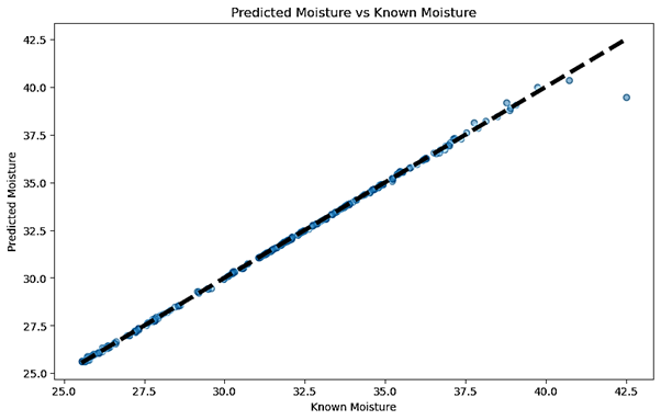
The results were promising. The scatter plot I’ve shared here shows how the model’s predictions stack up against the actual measurements. The proximity of the data points to the dashed line — where prediction perfectly matches reality — speaks to the precision of the model.
But what’s truly exciting is the potential application. With models like these, we can monitor agricultural land from a far, optimize irrigation, and even anticipate the impacts of climate change on different soil types.
As I continue to learn and grow in the field of machine learning, I’m constantly reminded of its potential to make a real-world difference — from the food we grow to the health of our planet.
#MachineLearning #RemoteSensing #Sustainability #AgricultureTech #DataForGood
0—The End—0
Conclusion
As I reflect on the past eight weeks, it’s clear that my journey into machine learning has been much more than just an academic pass/fail. It’s been a path of growth, discovery, and practical application.
From the fundamentals of Python to the complexities of real-world data interpretation, each step has reinforced my belief in the power of machine learning to drive innovation and solve complex problems.
This experience has not only equipped me with valuable skills but also ignited a passion for further exploration in this dynamic field.
As I continue to learn and grow, I look forward to sharing more insights and breakthroughs along the way.
But the highlight of this journey was undertaking my final project,
“Fault Detection and Diagnosis in Distributed Energy Systems using Machine Learning”
Want to know more about this project?
